Reimagining internal tools that leverage the latest features in generative AI for an asset management firm.
For this case study, I'll be focusing on the leadership dashboard project.
With written permission, I'm allowed to show the following work and processes with recruiters. However, some data or details have been censored to comply with confidentiality agreements.
Users completed tasks 2x faster when using the tool in their workflow
Projected to save ~$3.2 million annually if all associates use it
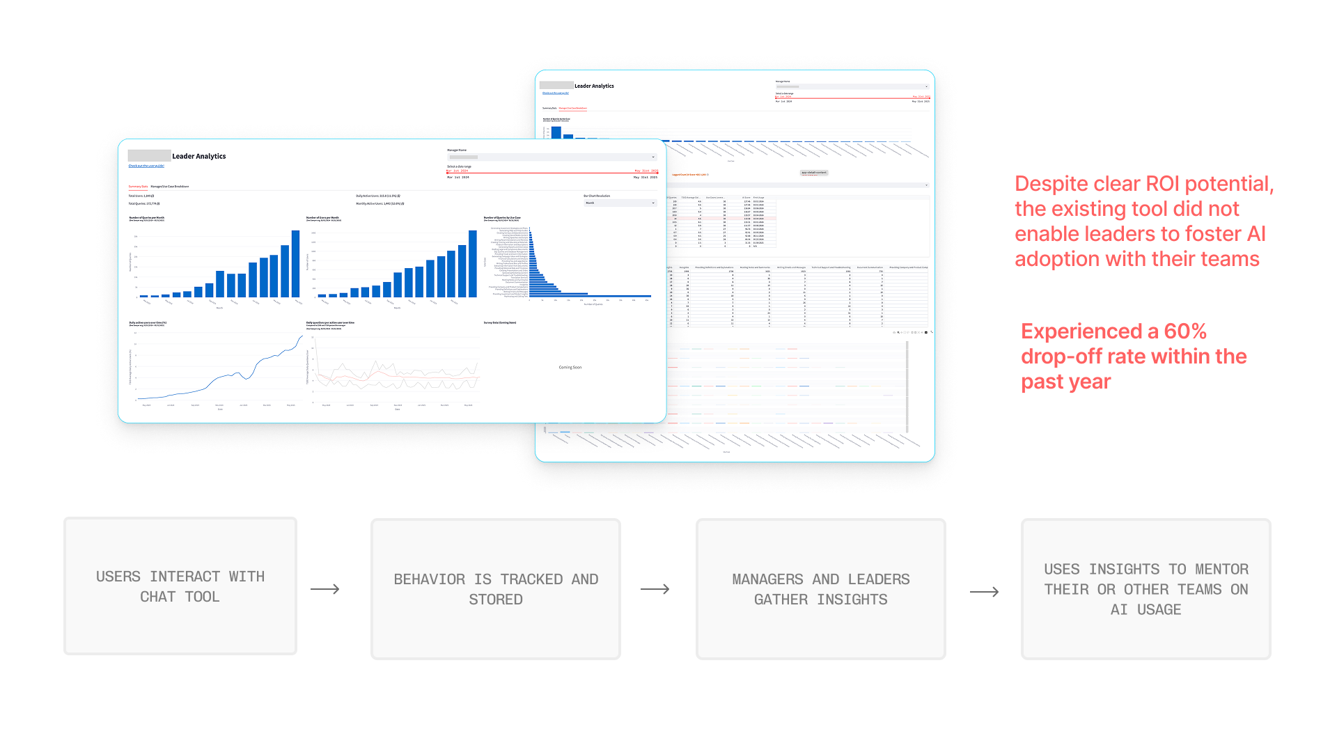
Only 10-30% of those with access actually use this chatbot
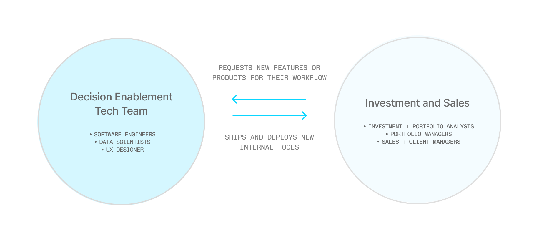
Provides relevant info and actions to empower decision-making for leaders.
Will live inside an existing ecosystem of other internal tools
Adhere to an existing internal design system and reuse existing components
Product complexity and customizability is limited due to a small developer team
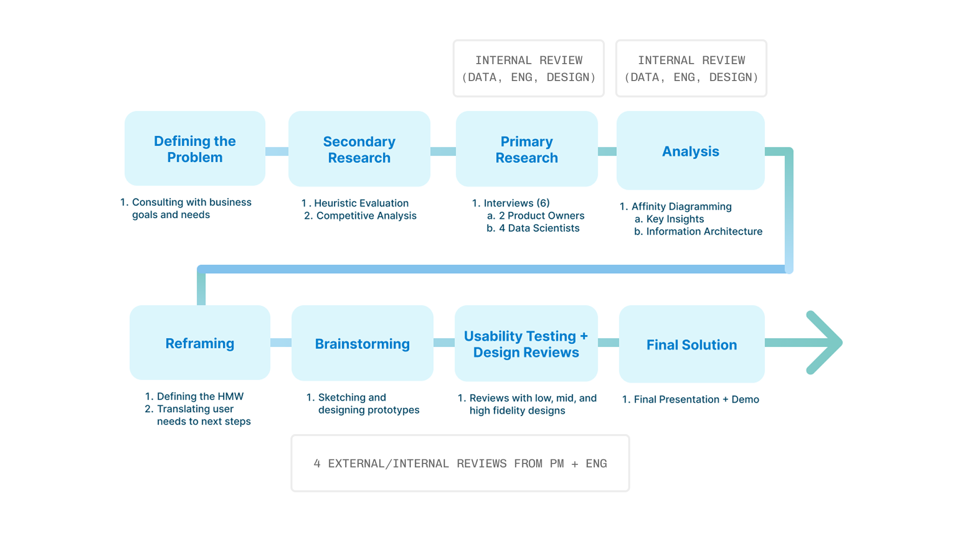
I conducted a competitive analysis on current dashboard applications to familiarize myself more with how dashboards and internal tools can be designed for different interactions and uses.
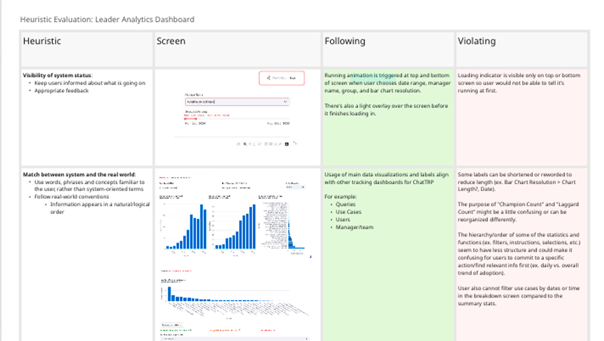
Since my project was about an existing tool, I also conducted a heuristic evaluation to see which heuristics the current application was adhering or violating as a basis for potential user pain points.
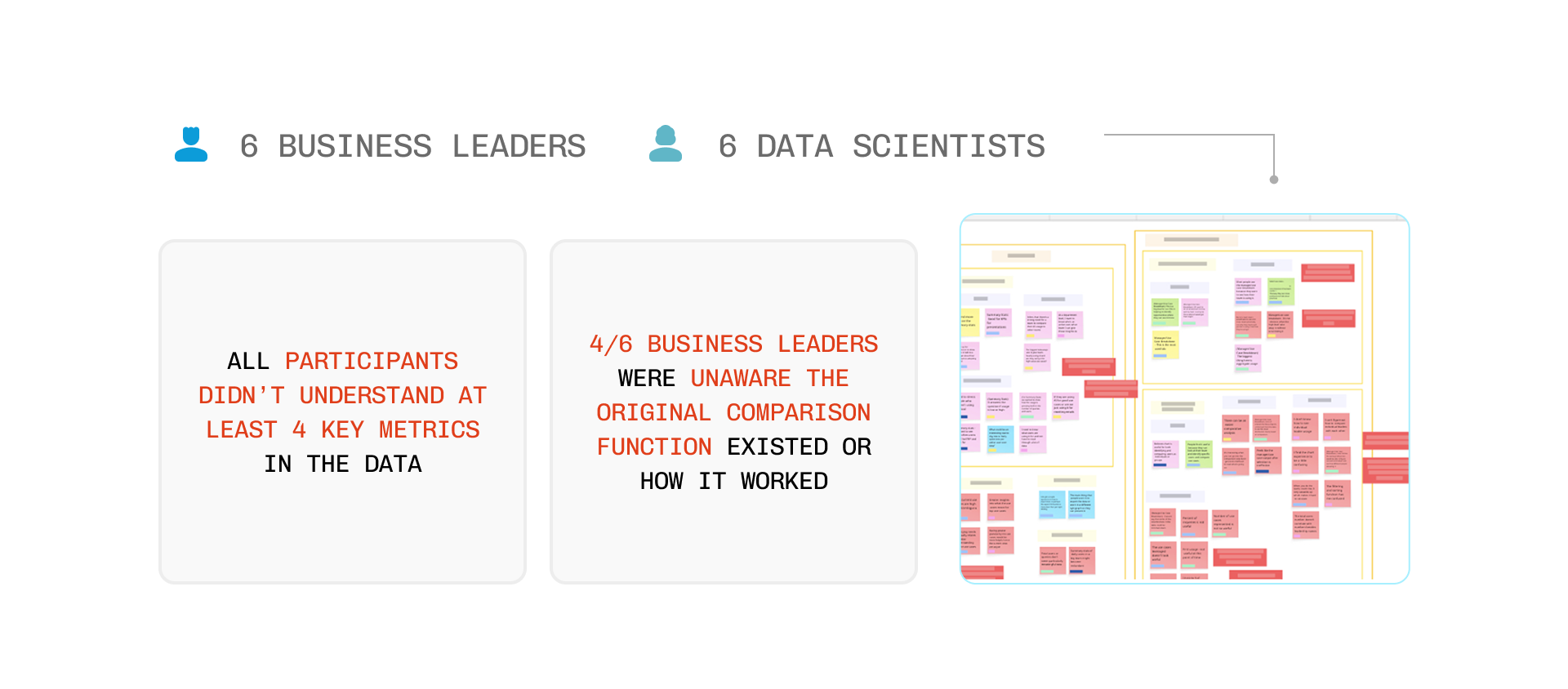
For my primary research, I interviewed 6 business and 6 data scientists.
Afterwards, I sorted and synthesized emerging patterns within my notes with affinity diagramming.
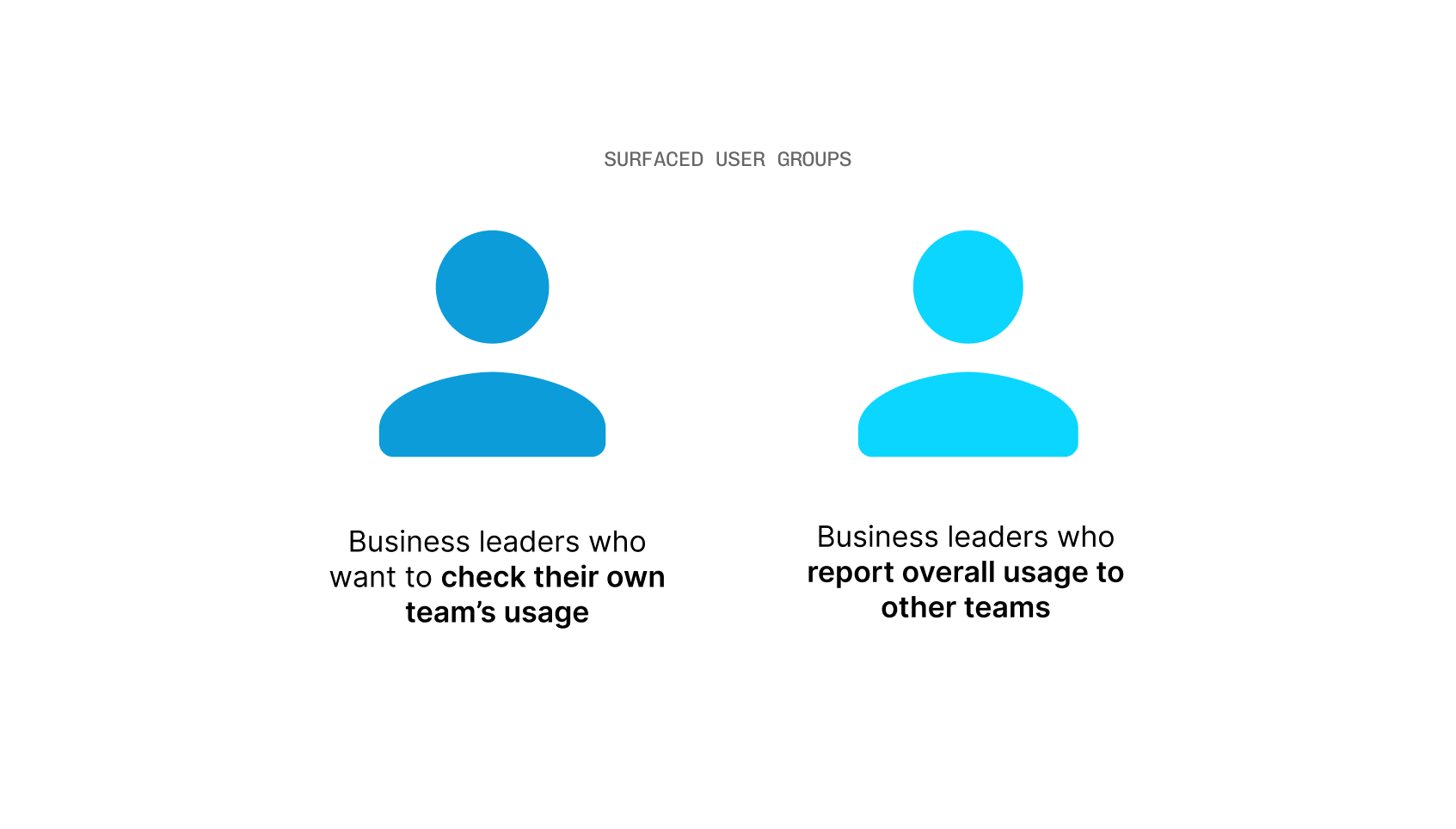
As I was interviewing, I realized that there was two different user needs and use cases for the dashboard when it came to the business leaders who used them.
This was essential when it came to discovering how to best optimize the tool with both the summary stats and manager/use case breakdown screens.
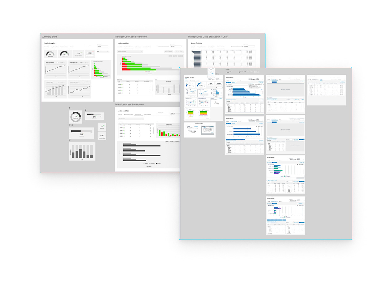
After synthesizing my research, I started sketching different features and ideas that address the user pain points that surfaced in my research.
Some of my low-fidelity ideas involved representing data in different forms to see which is more readable. A lot of it was also to validate which information was needed on the dashboard that could be missing or to amplify user understanding of what already exists.
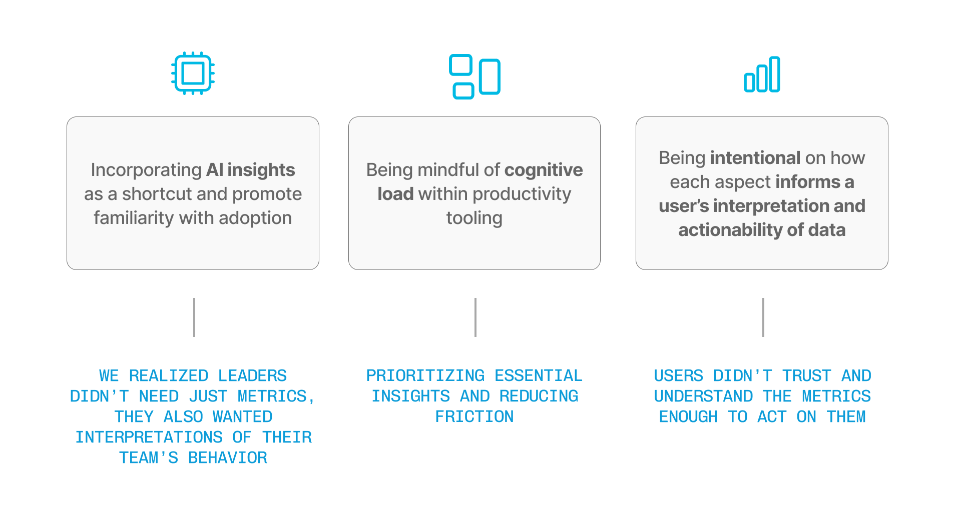
A major challenge with the original dashboard was the inability to compare individuals and groups of people in a large organization. There was also expressed difficulty with the drill down feature since it was reported as not being seamless when searching for a specific individual.
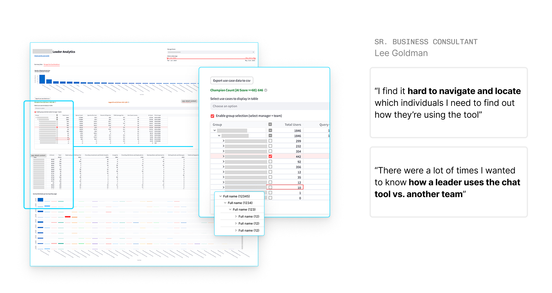
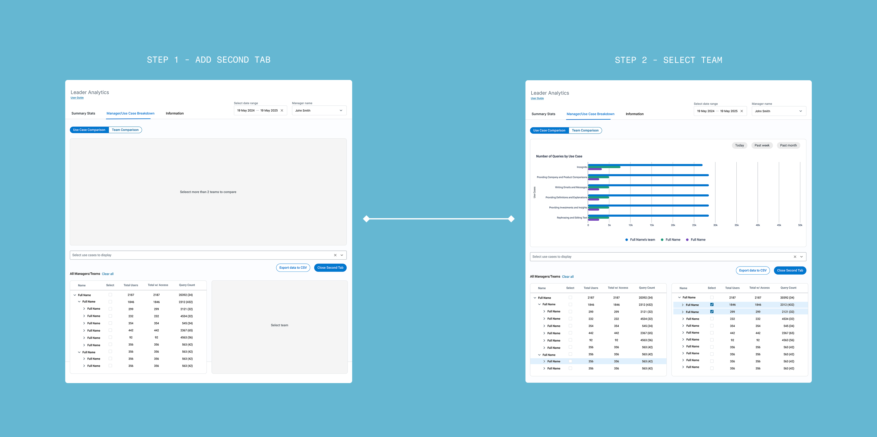
Partway through the design iterations, a key idea I had was to make the dashboard have multiple windows or split view so user drill down can be more efficient. After doing an internal review, though, I decided to pivot from this idea as I realized this would overcomplicate the comparison features.
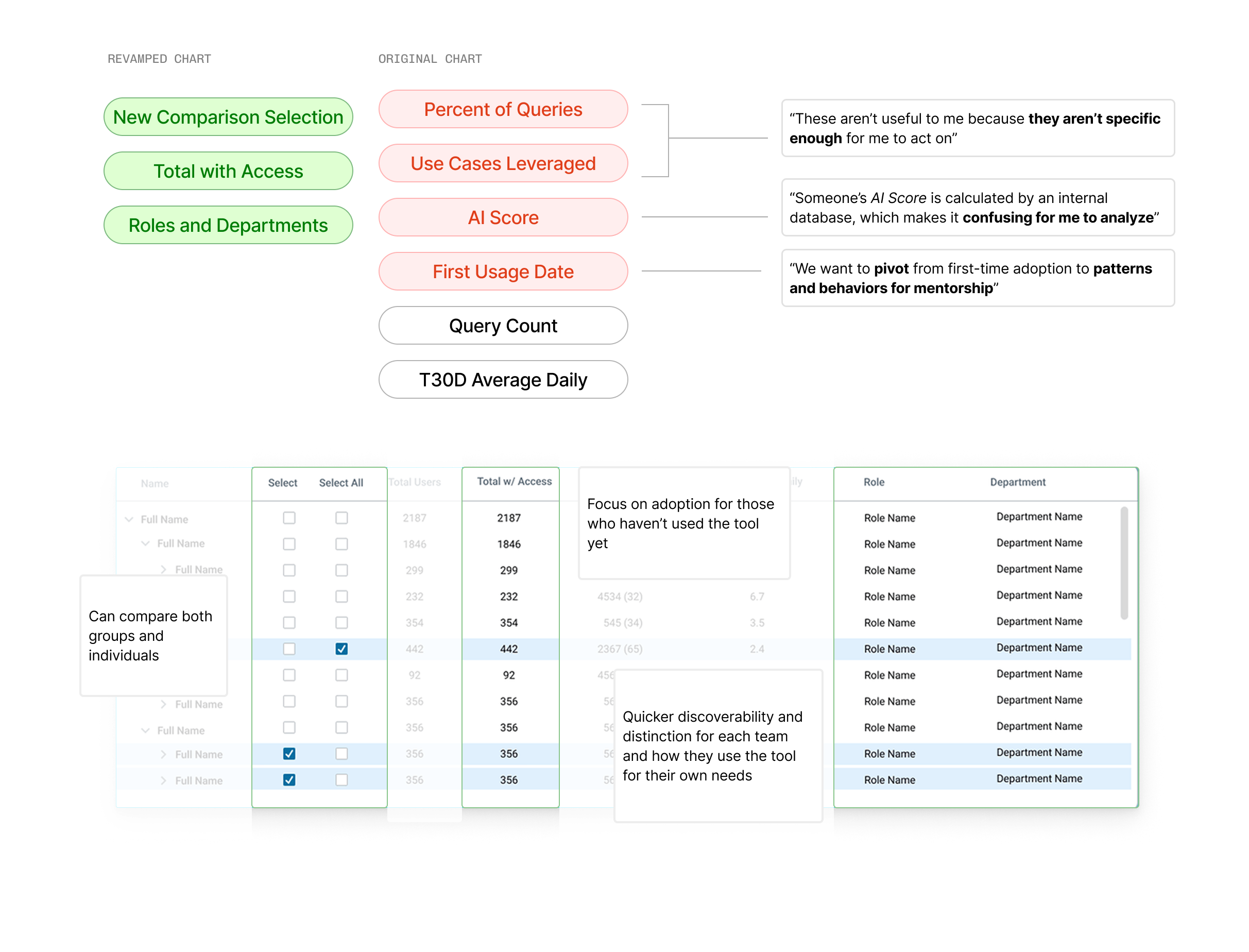
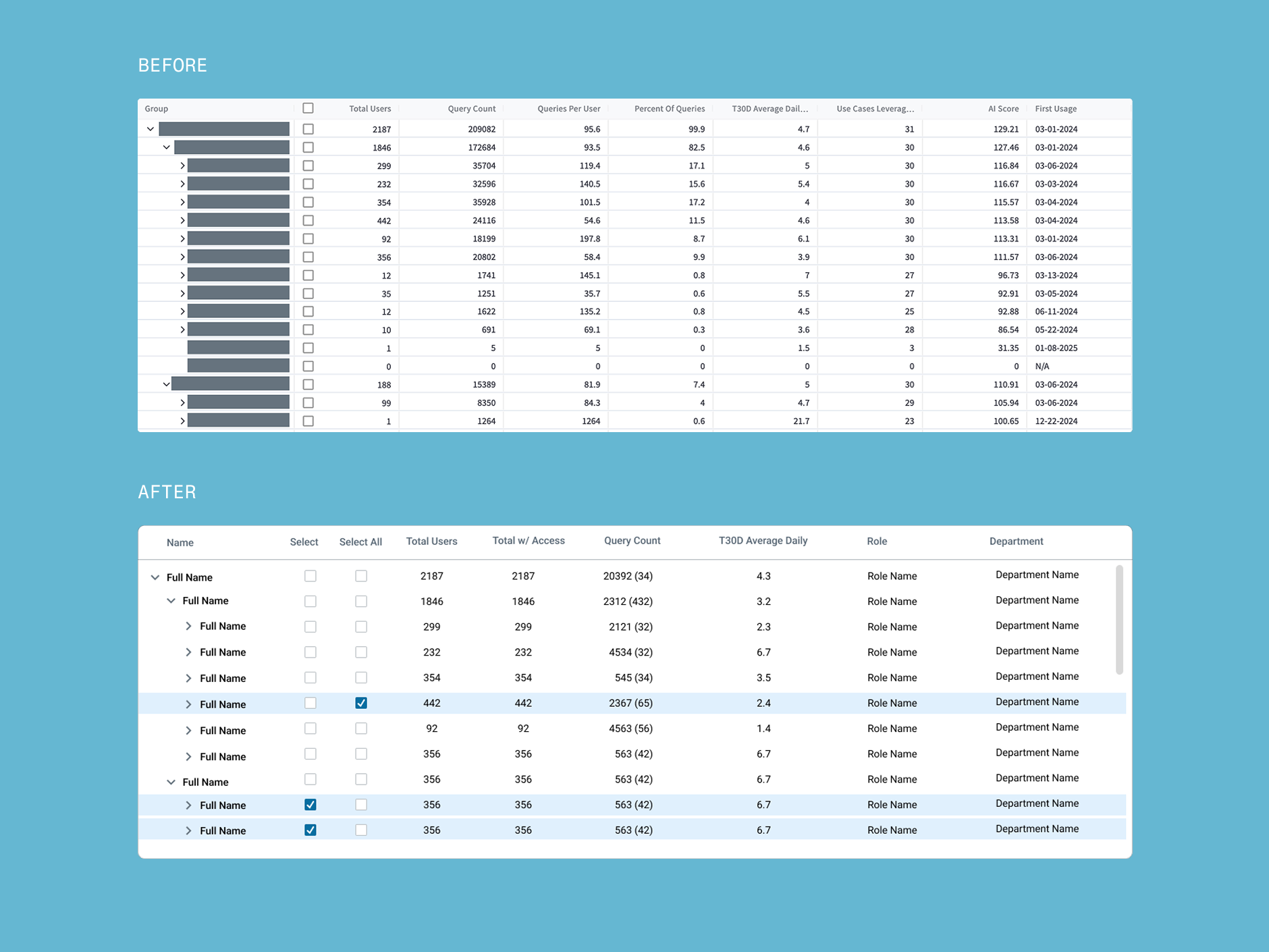
Another big pain point was how a lot of data reported among users were not relevant and took up a lot of real estate with the chart view. Through interviewing and conducting design reviews, I selected which information to include or subtract so that the default view was optimal.
We then refined a direction based on priority of needs, the context in which this feature would live in, and technical feasibility.
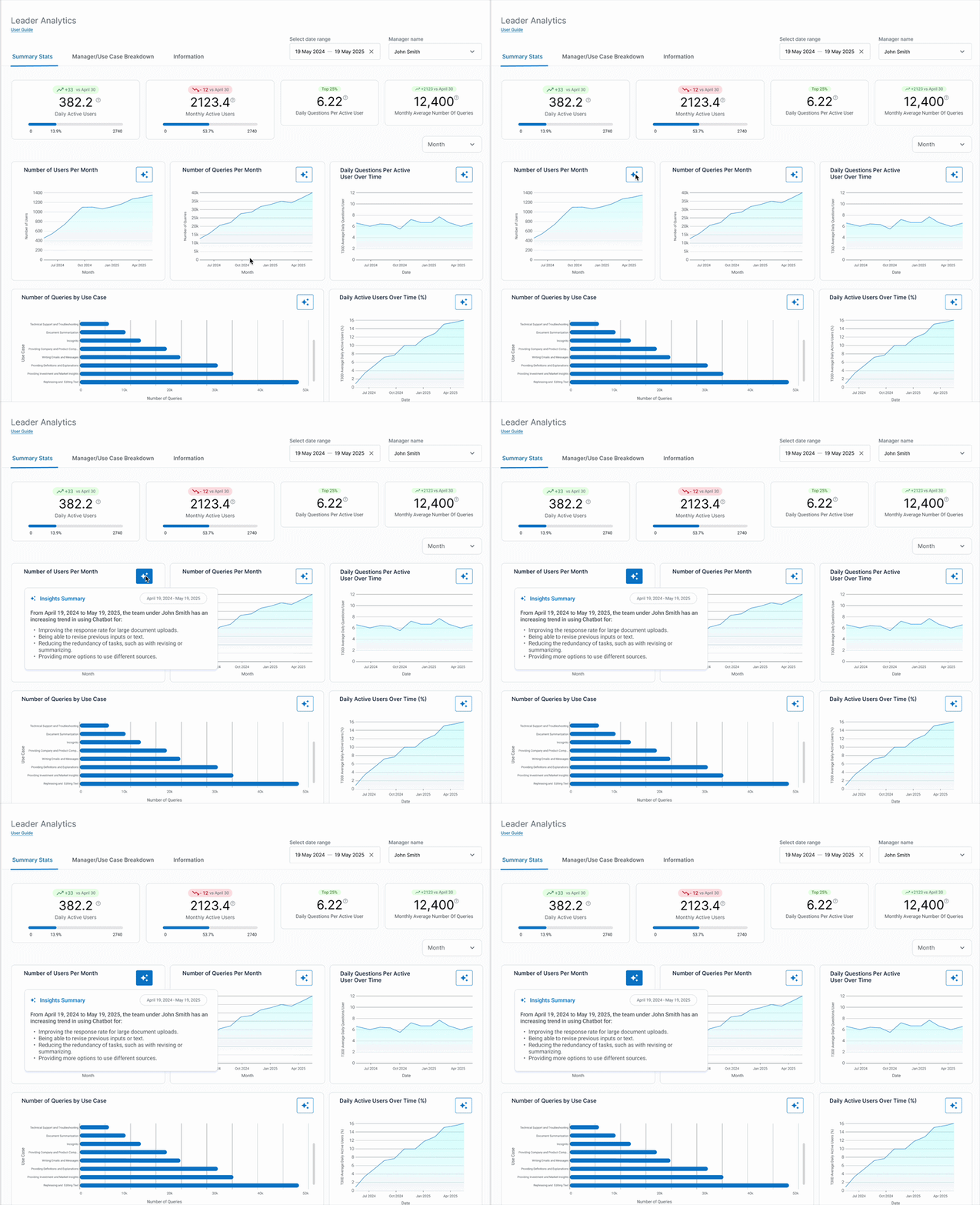
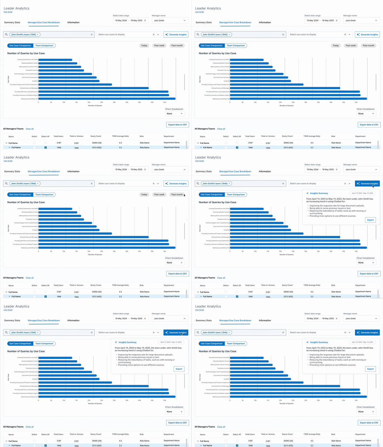
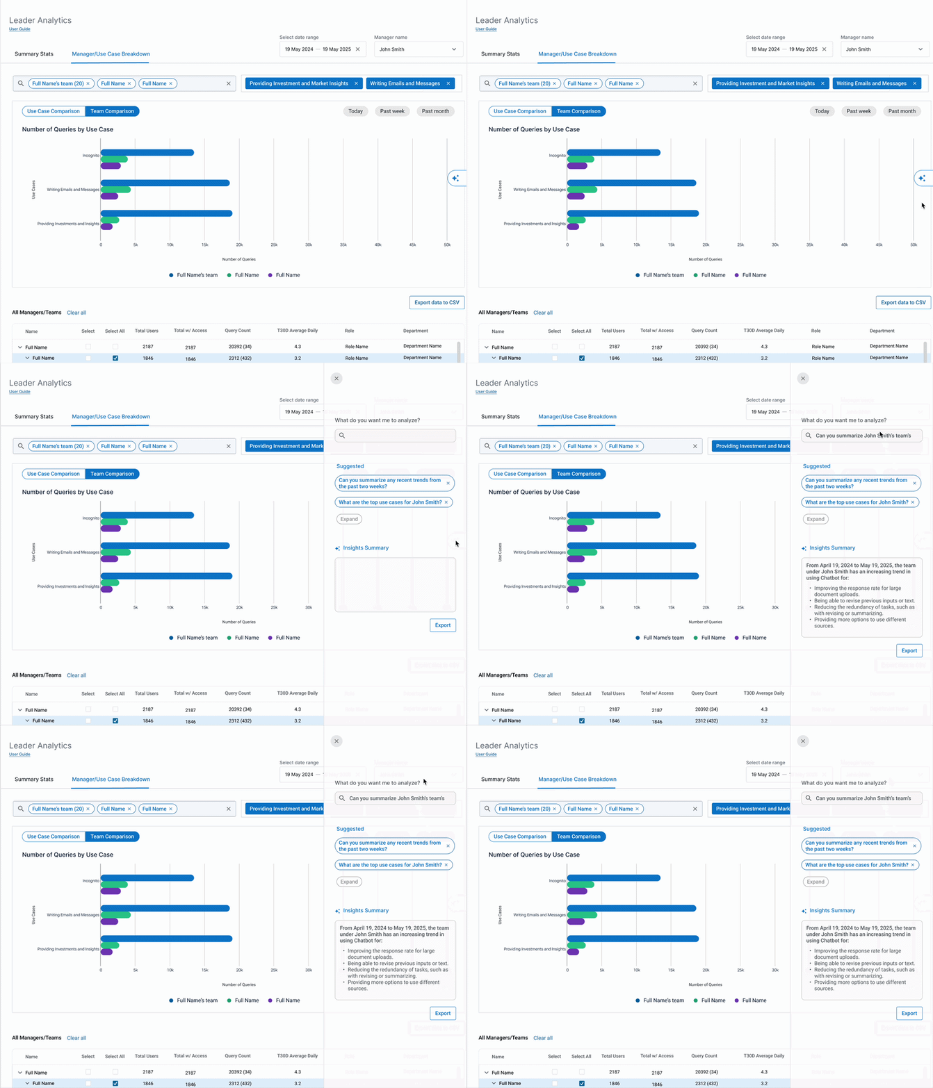
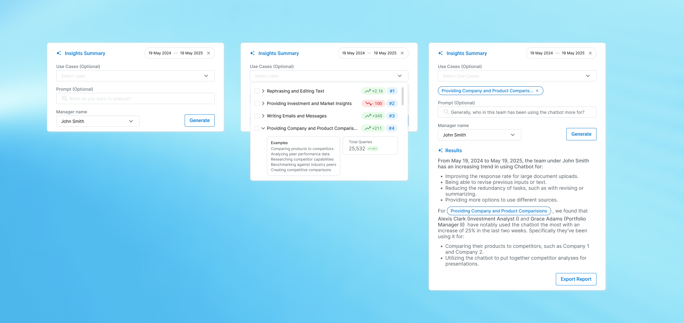
1. Modules have AI insights
2. Generating insights from context
3. Sidebar to request AI insights
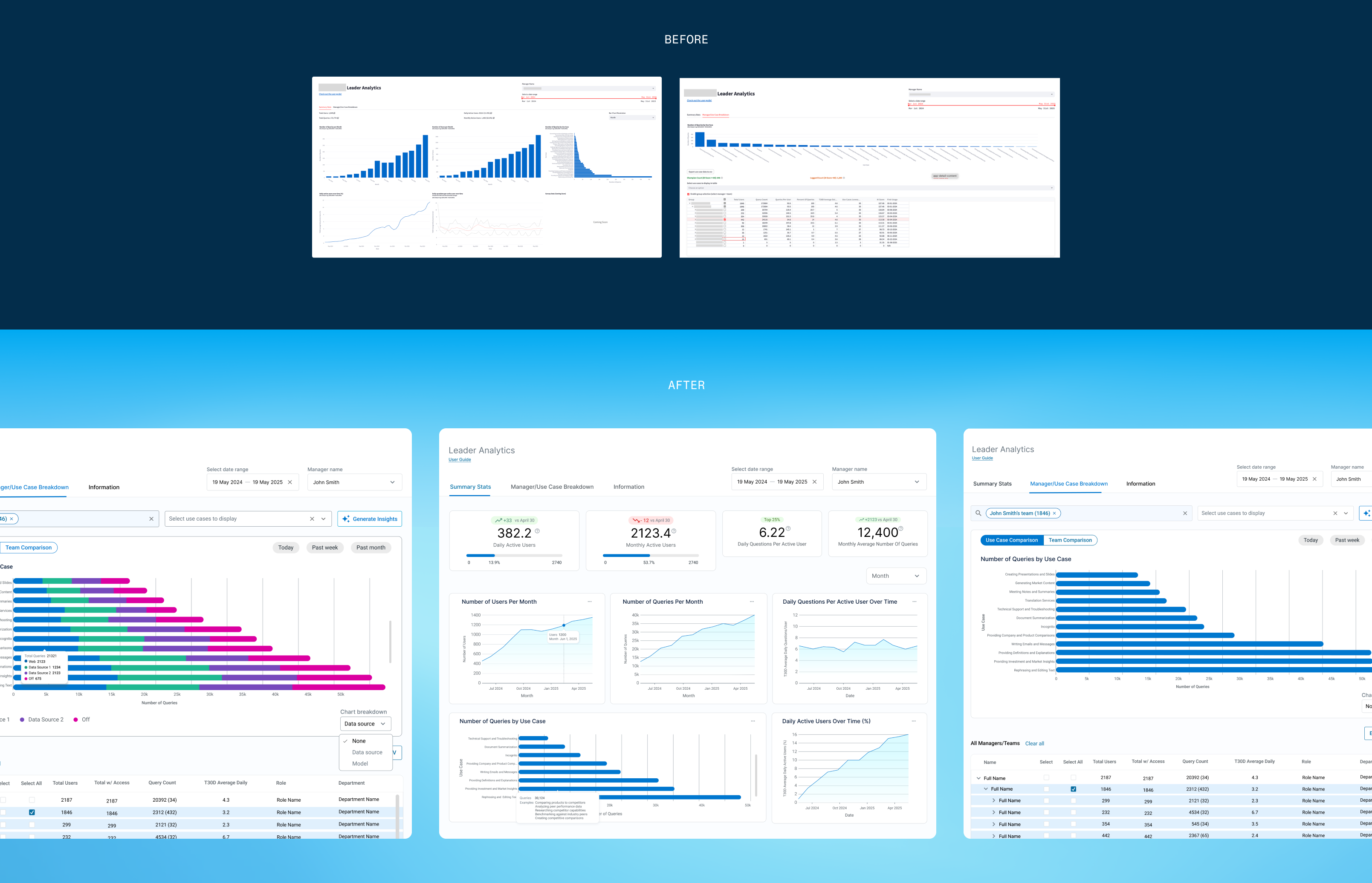
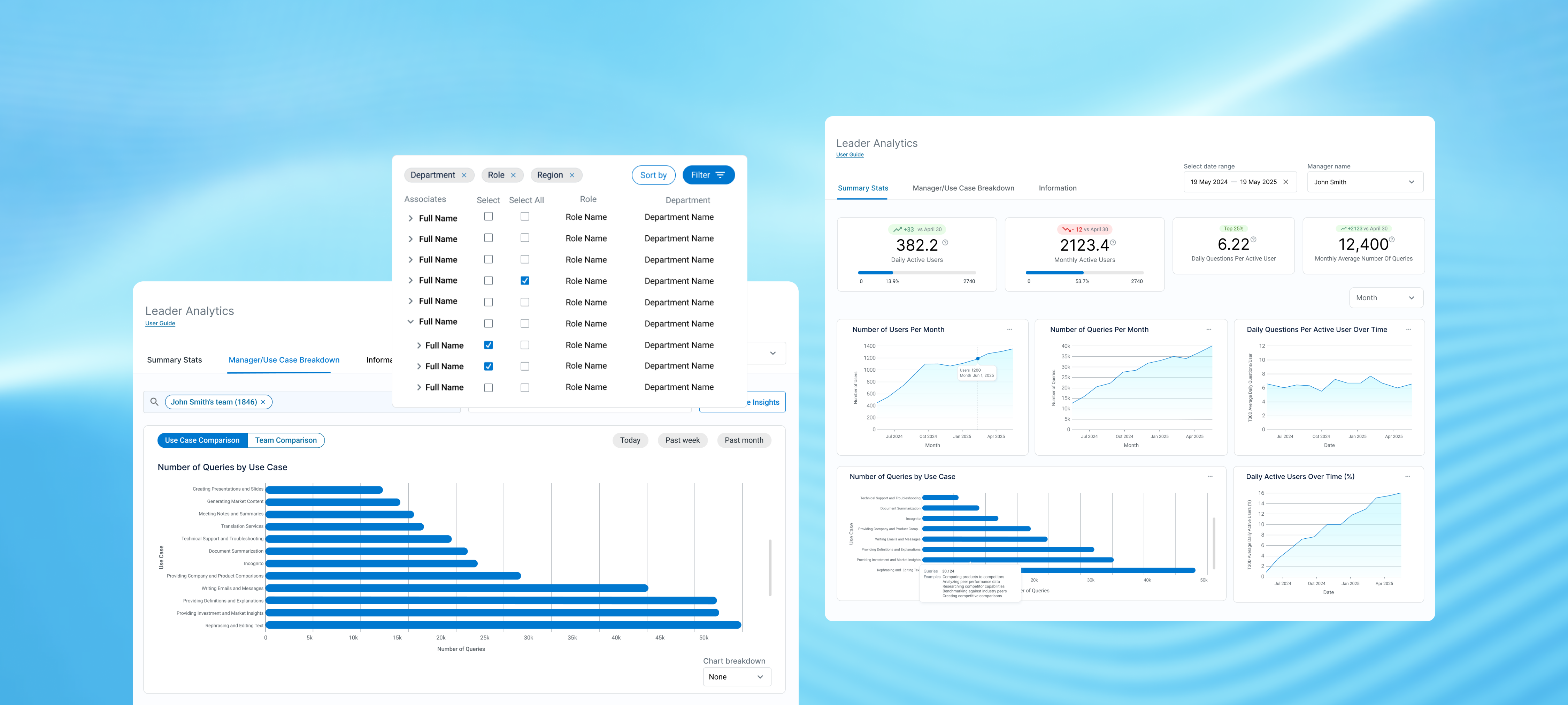
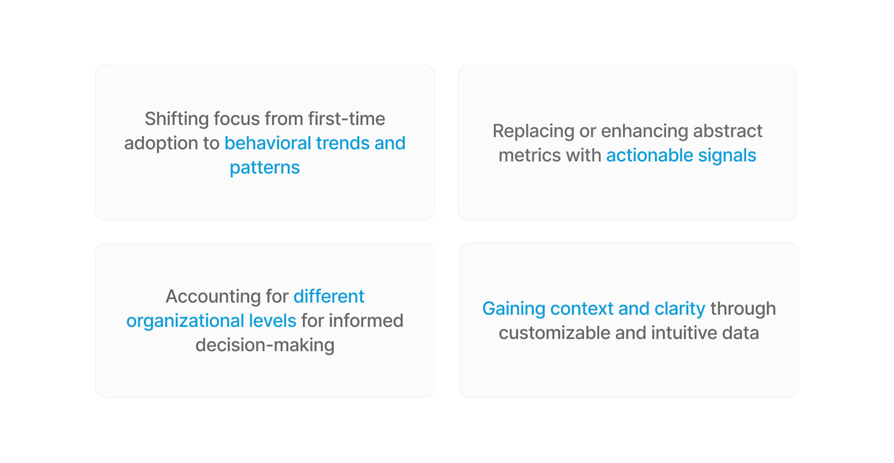
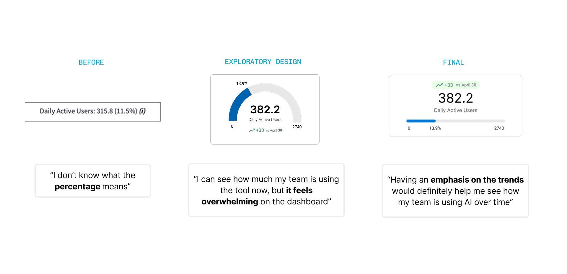
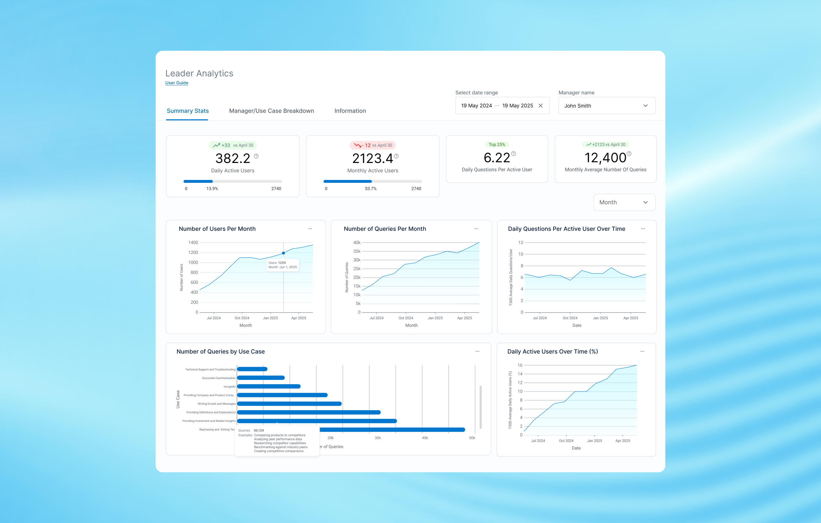
Through curation and visualization improvements, I altered the summary stats so that it was more centered around trends in the data. Additionally, I added specified tooltips for the use cases in the data so it more accurately reflected what the data meant.
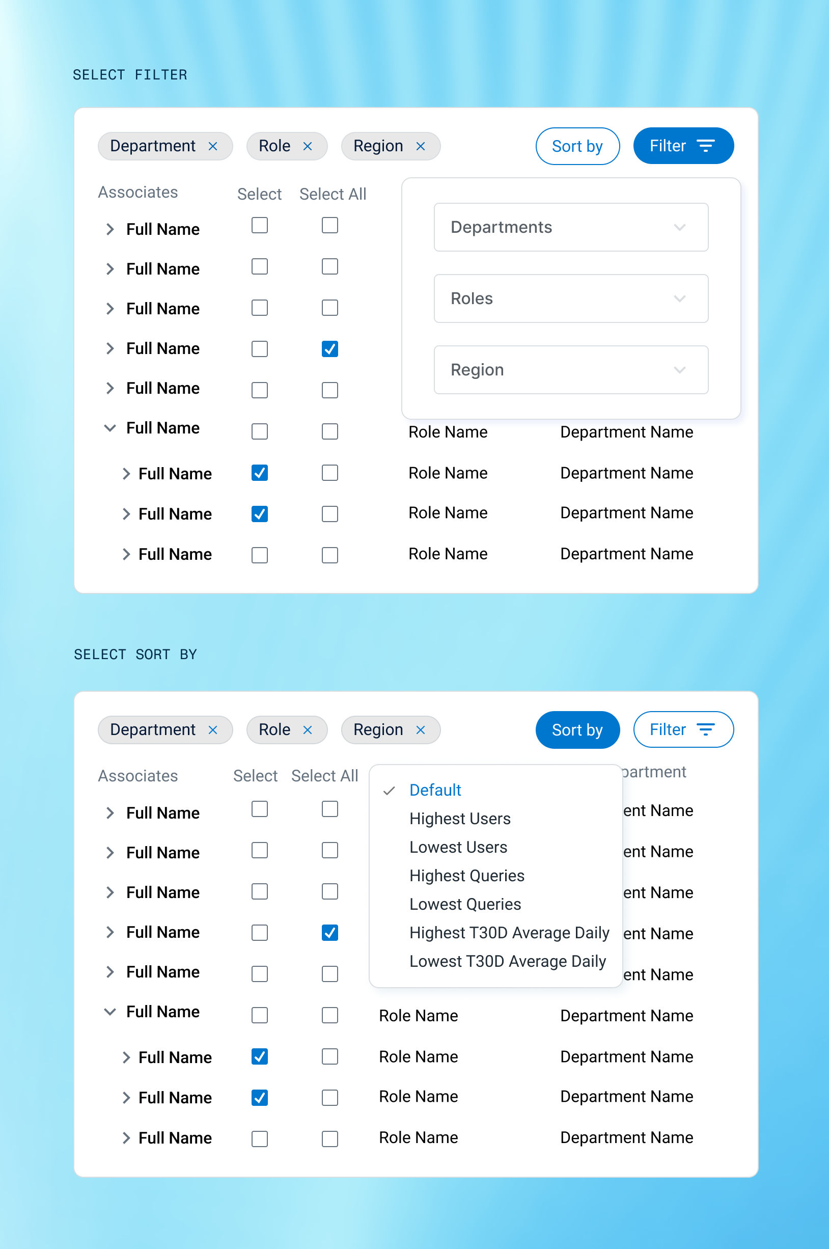
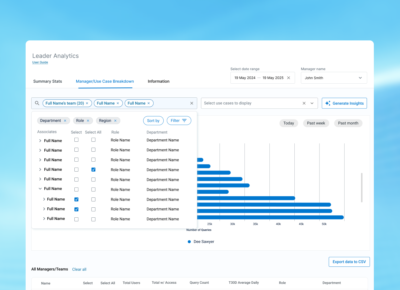
Narrow down your selection of teams or people by searching and filtering people based on their region, department, or role instead of just from the chart.
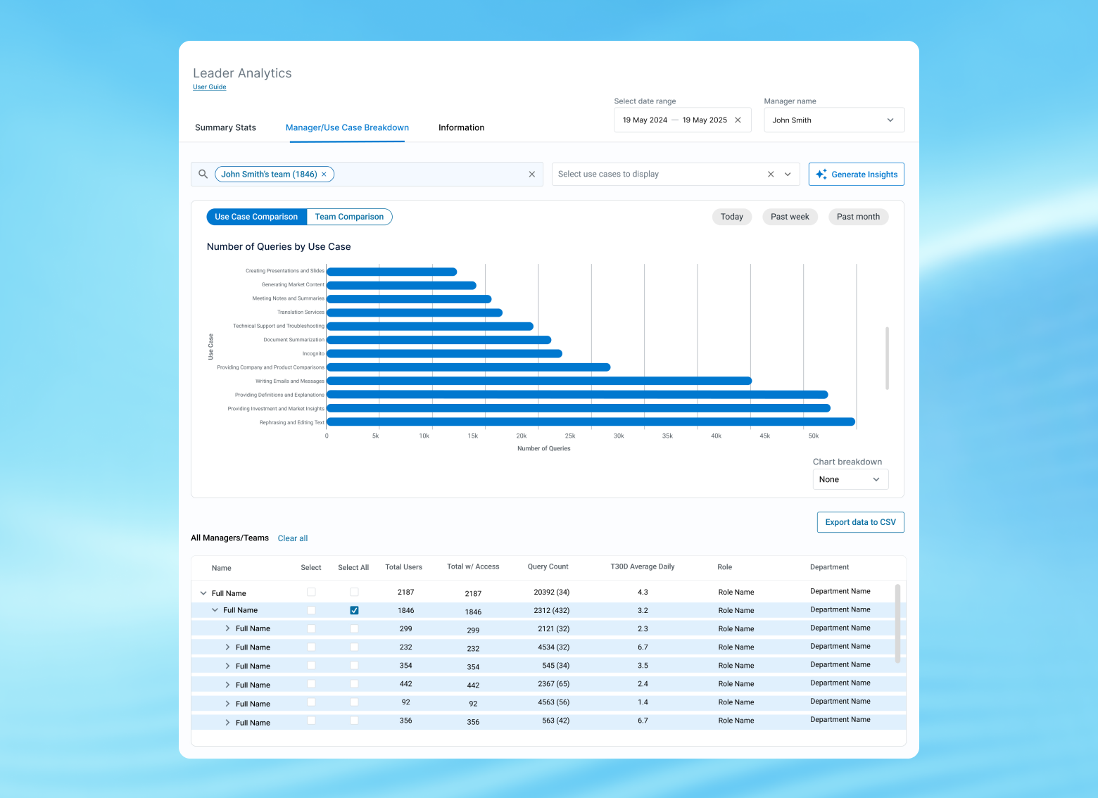
To maximize discoverability and usability of both the comparison and use case, I created two views (use case and team comparison) of the model so it was easier to see metrics in the data. For use case comparisons, it focuses more on aggregate data of all selected people with a data source breakdown.
DATA SOURCE BREAKDOWN
Another suggestion by the product owners for their emerging needs was to have a breakdown of different data sources users used. This would be another way to provide actionable information between different managers in how other users are using this tool for their work.
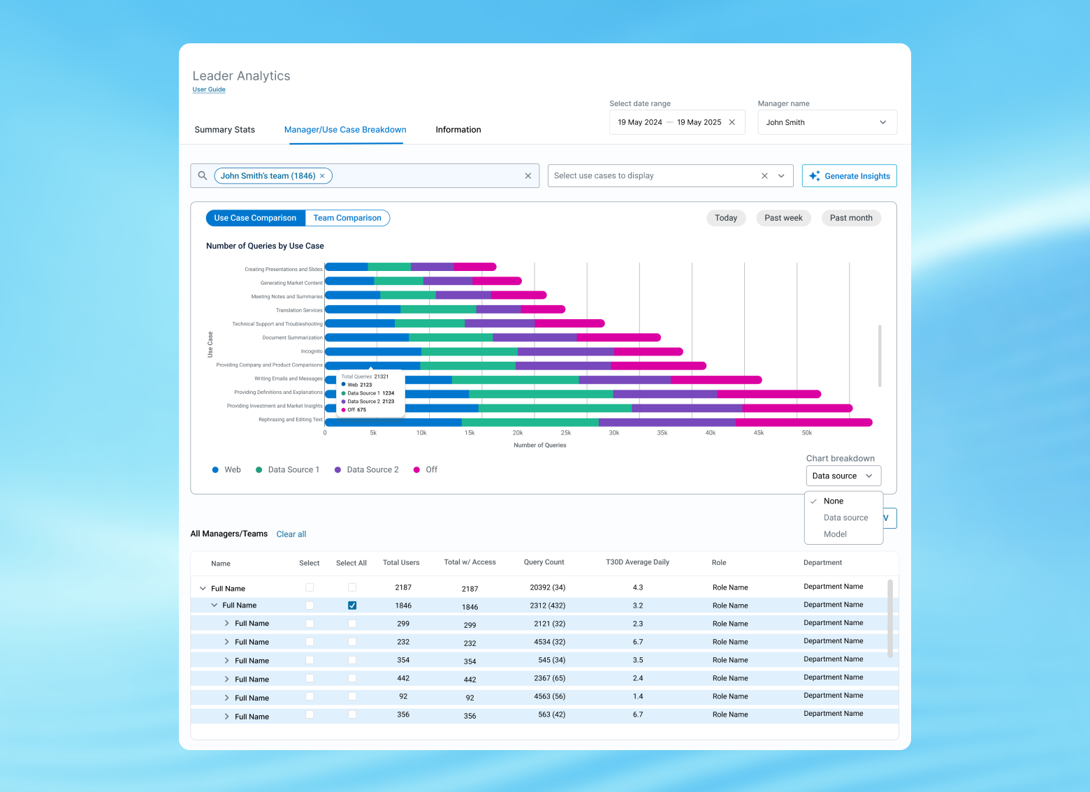
DATA SOURCE BREAKDOWN - USE CASE
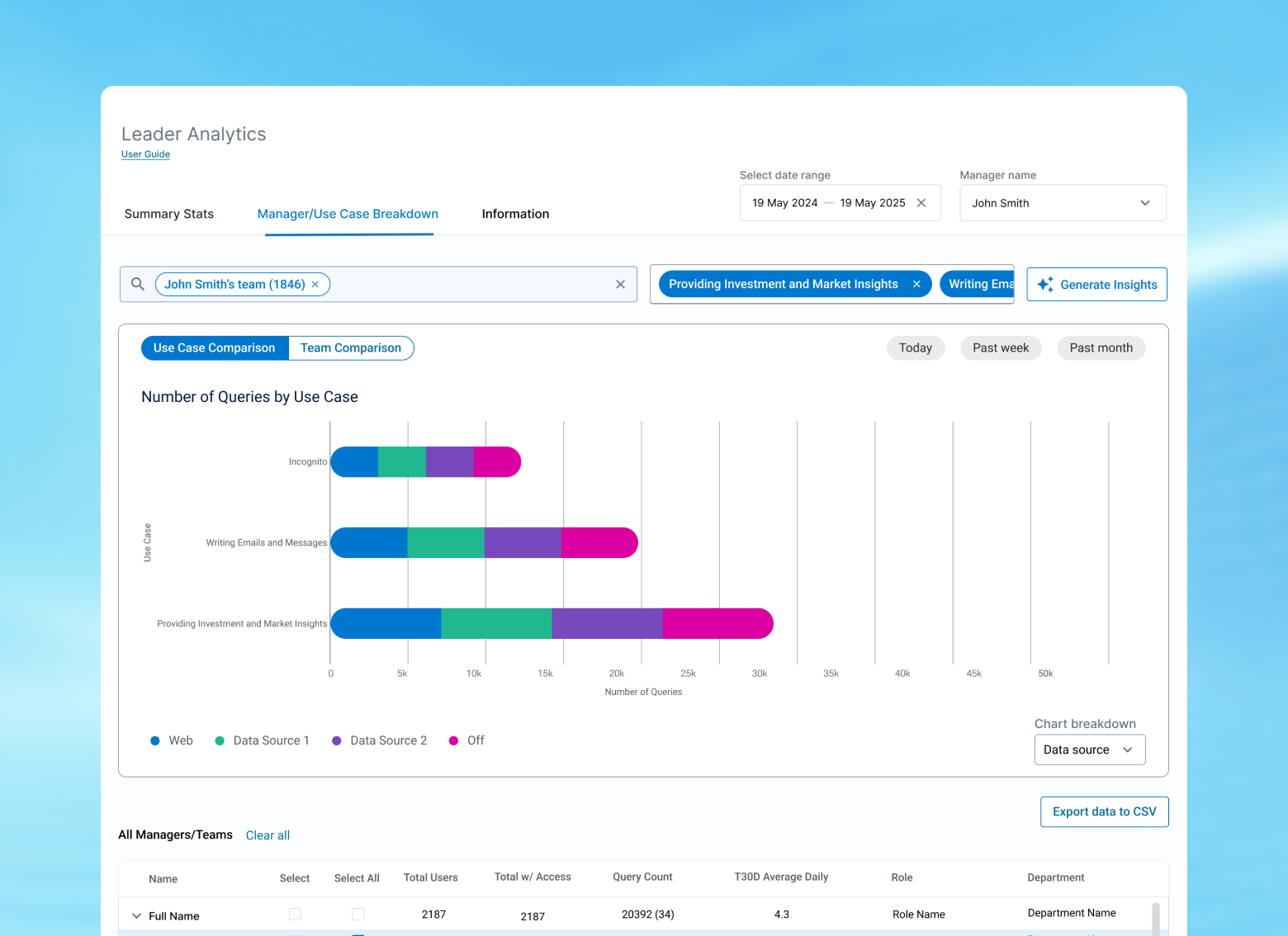
Customize your view further by selecting different use cases to display to hone in on specific metrics and insights.
For this view, users can see a comprehensive breakdown of how other users are using this tool in comparison to others. This can done either through searching in the top tool bar
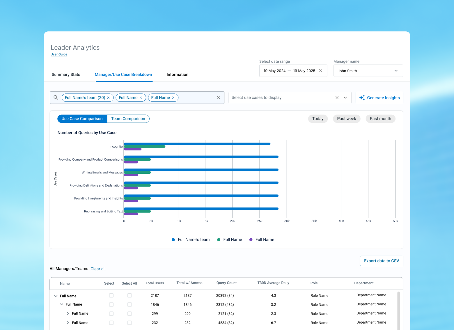
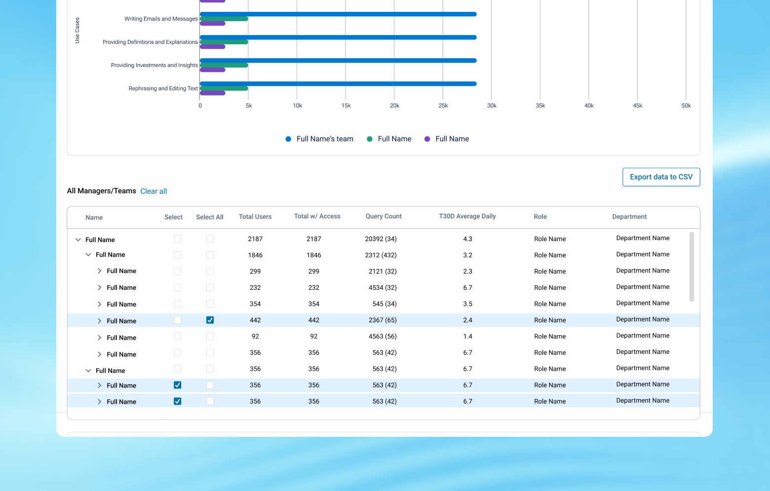
SELECTING TEAMS VS. INDIVIDUALS
Even when selecting people via search, the chart will automatically update and check off who was manually selected. If they're a manager, the names of those below the person are highlighted to indicate to the user they are incorporated in the data.
FILTER BY USE CASE
Combine the use case filtering functionality with the comparison feature to get curated insights.
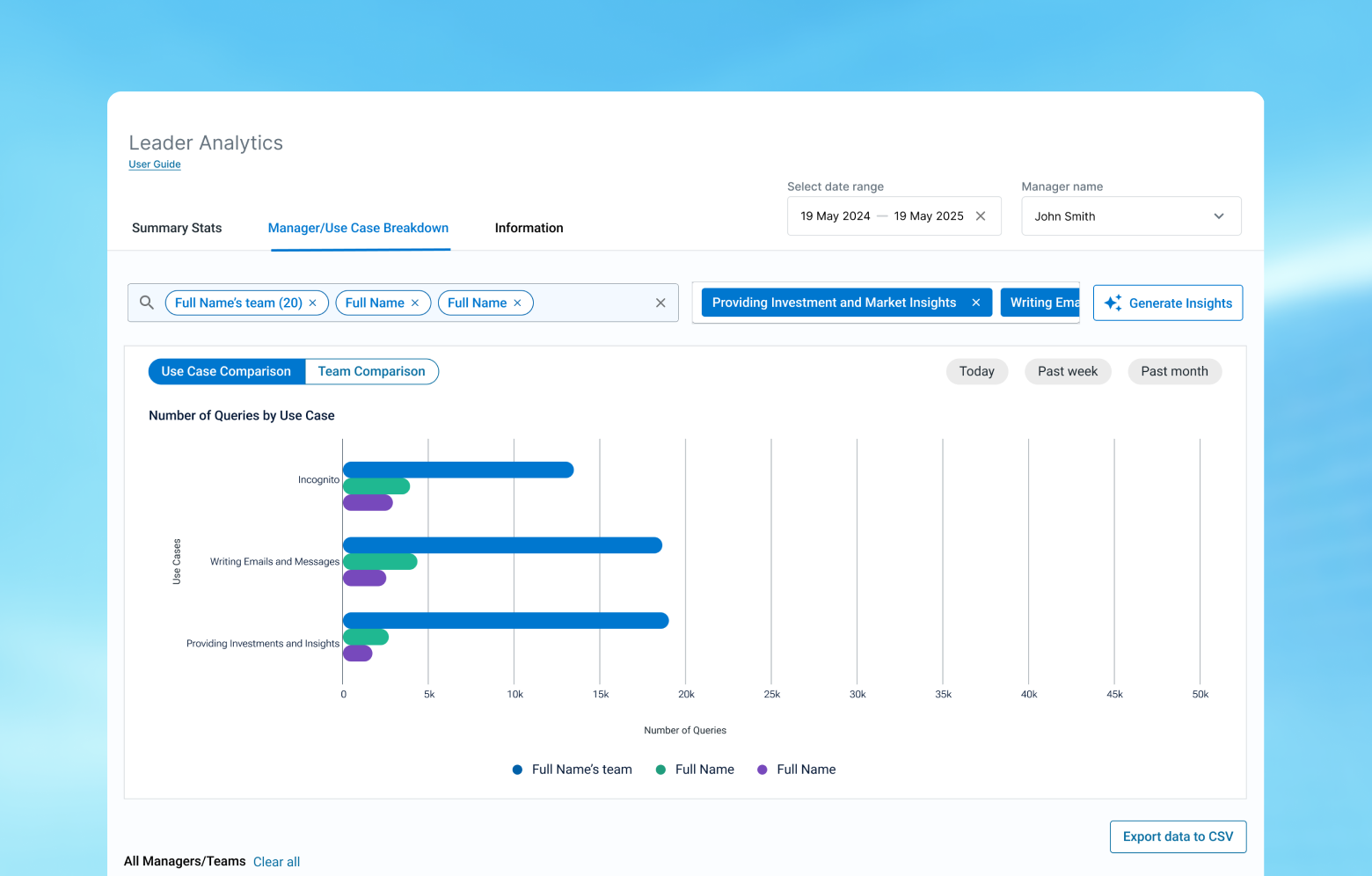
If users want a quick, high-level summary, they can generate key insights based on their selections in the data.
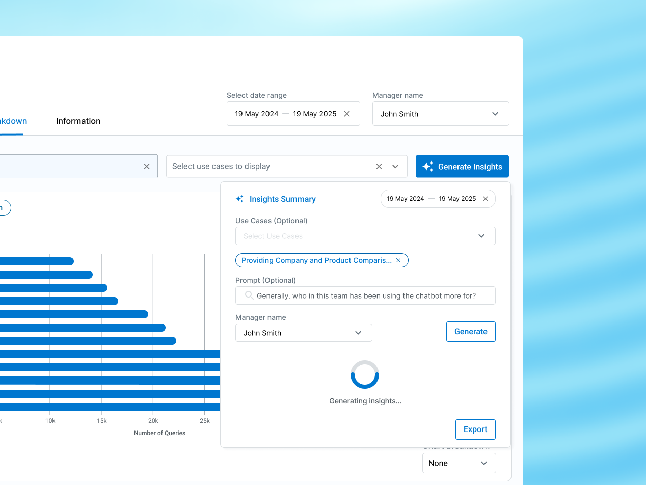
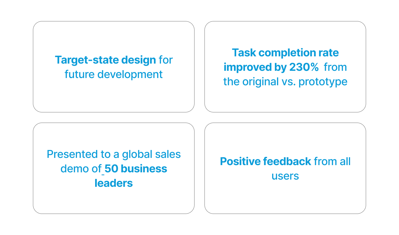
My first project will be used for the target-state design for development later in the year! My second one is actively being developed and launched right now within the company.
The product owners were excited for my work during the final design presentation and review of 50 other sales leaders and said it was a major design improvement from the original dashboard.
Working at T. Rowe Price was an incredible experience where I got to work alongside a passionate and talented team! Some key learnings I had were:
1) Frequent design reviews, reiteration, and feedback from both the development team and product owners are essential to creating an impactful product
2) Learning how to take initiative on my workflow and design decisions
3) Different ways that AI can be used not just in the asset management industry but also in our day-to-day lives (also how UX plays a significant role in it)
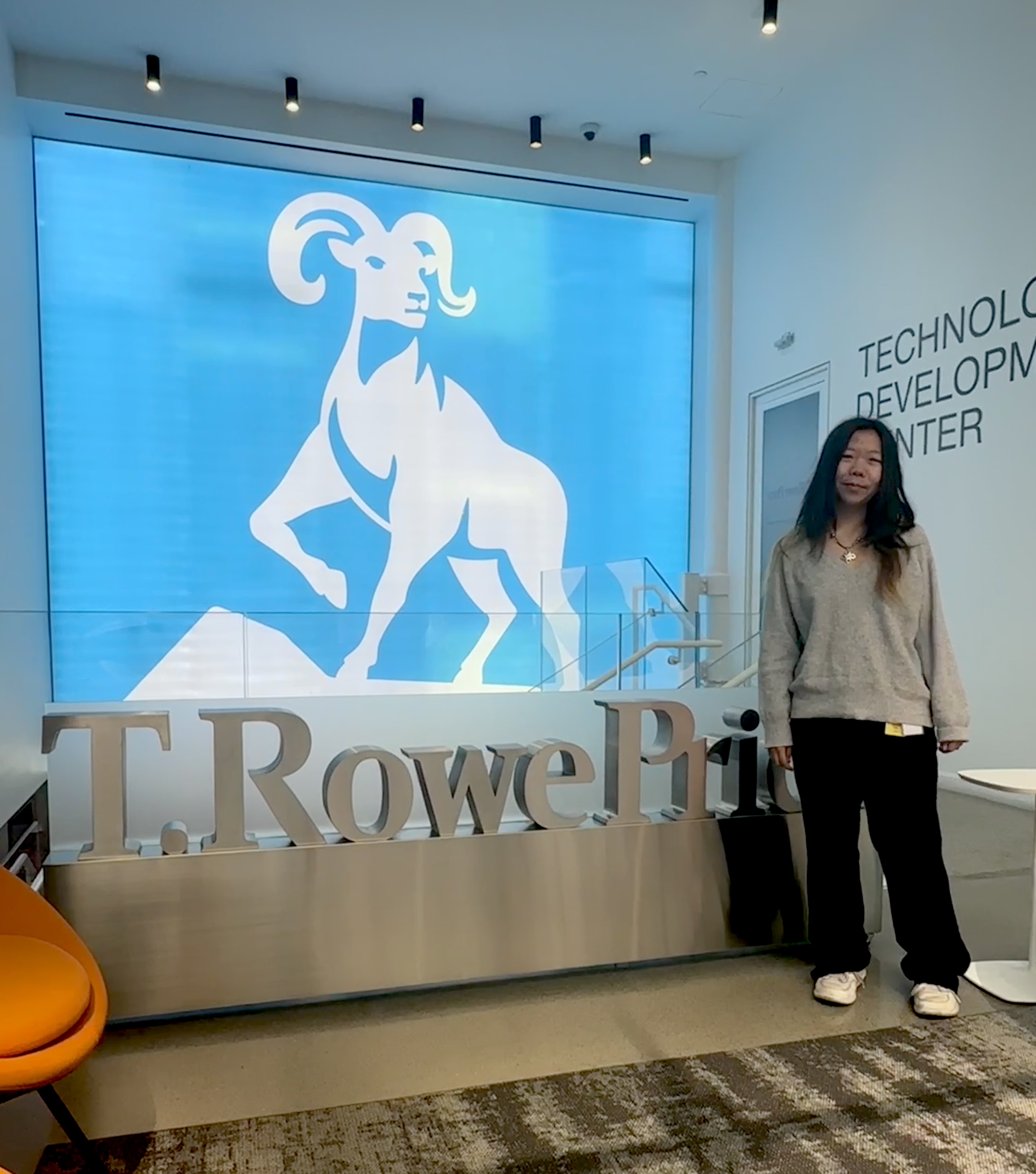
ME @ THEIR OFFICE
LAST UPDATED: JAN 2026